Mind + Body
The Product:
A dedicated mobile app and responsive website that helps support those with eating disorders through meal logs, check-ins and social support.
The Purpose:
To design a user experience for social good specifically, to help those recovering from eating disorders.
My role: Lead UX Designer
Duration: July 2021
UX Research
The user research comprised of hour long interviews. Interviewees were screened by answering the question "have you sought support for disordered eating, weight or body image issues?" People who answered in the affirmative became interviewees. Four participants were interviewed by phone or video chat.
My initial assumption was to create a diary app/website that allowed users to keep track of their meals and record their thoughts. As I spoke with the interviewees I identified that there was a further need to have support surrounding meals. Additionally, some felt isolated during the day and wanted the ability to have help not just at meal times.
Problem Statement:
Jordan is a social college student in recovery who needs to have support at her fingertips because she wants to feel more confident in her day-to-day activities in recovery.

Problem Statement:
Brooke is a person in recovery who needs to make supportive connections because she wants to have people to turn to when she needs help.

Competitive Audit:
The audit of direct and indirect competitors demonstrated where there were gaps that could be filled to further support those with eating disorders.

Starting the Design
Ideation:
Following the competitive audit, I did an ideation activity (Crazy Eights) with a focus on: meal and daily check-ins along with support from the community or coping skills
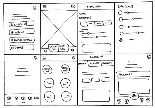
Digital Wireframes:
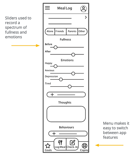
Following paper wireframes digital wireframes were created for the eating disorder support app: Mind and Body. Designs focused allowing users to identify ranges of emotions and fullness levels.
Low Fidelity Prototype:
Next I created a low fidelity prototype. I ensured that the user could navigate to any feature through the bottom menu bar.

Usability Studies


Refining the Design
Mockups:
Following the usability study I added section breaks to make the meal log easier to understand.
Additionally,I segmented the goals as users wanted to have both weekly and monthly goals.


High Fidelity Prototype:
For the prototype I ensured all pages were accessible through the hamburger menu with the most important pages accessible through the bottom menu bar.

Accessibility Considerations
-
Contrasting colors were added to the action buttons to make them easier to distinguish.
-
Hierarchical headings were added to make page to page navigation more apparent.
-
Where possible icons as well as text was added to aid understanding.
Responsive Design
Sitemap
The goal of the website was to provide a diary service for meal logs and check-ins while also providing support. To do this a hierarchical architecture was applied.

Responsive Designs
I designed for three different screen sizes, phone, tablet and desktop. Modifications were made based on user needs. For instance I added more sections on support for the larger screen sizes to the home page.

Impact
This app allows users to find support around their meals and during the day. Users liked that the app and website was more than a food log. One user commented “this seems really useful. I would definitely use this.”
What I Learned
I learned more about the eating disorder recovery community and how everyone’s journey was different. I learned how to take user needs and incorporate them into a useful solution such as allowing users to customise their app experience to meet their individual journeys.
Next Steps:
-
More UX Research for the website to identify additional features that could be incorporated.
-
Add in a feature where users can direct message with other users.
-
Incorporate a feature surrounding mealtimes. Perhaps allowing users to dine together.